Visualize Logs
The Debugger Dashboard is the interactive workspace where you can inspect the contents of a log visually. It’s built so you can explore time-series data and message streams, add plots, mark intervals, and collaborate using a chat-like assistant — all from a clear, user-focused interface.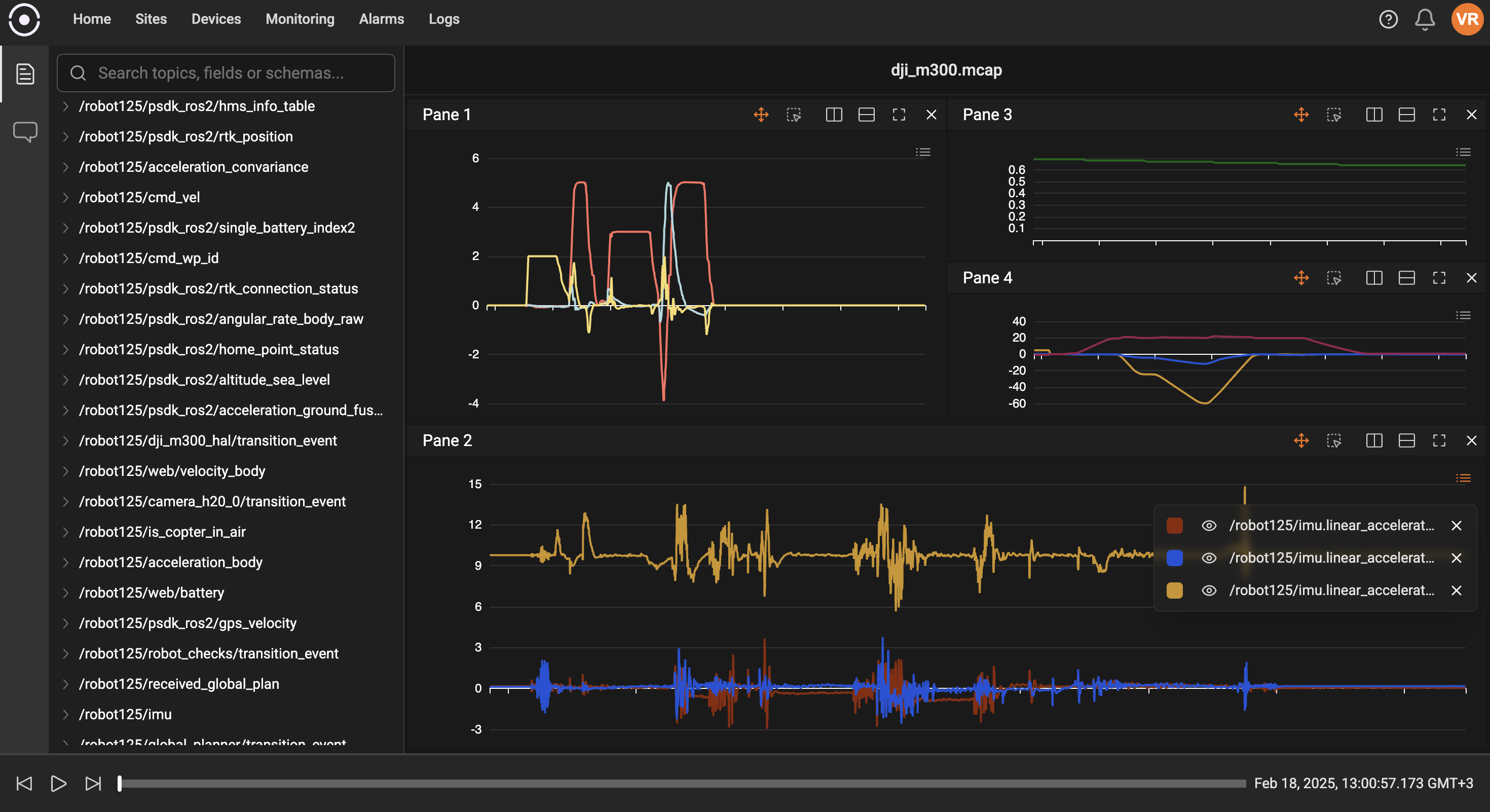
Main areas of the dashboard
- Left navigation: Choose the active workspace component (for example, the Topic Explorer or Chat). This quickly switches the main content area between exploring topics and conversing with the assistant.
- Center workspace: The area where plots and visual panels appear. Each panel (or “pane”) can show one or more plots, and you can rearrange panes to match how you like to analyze data.
- Right-side timeline/controls: A compact timeline and playback controls that let you zoom and move through the recording period. Colored intervals (annotations) are shown on the timeline to highlight important sections.
- Top / side toolbars: Quick actions to add plots, save or load dashboard layouts, and change view options.
Topic Explorer
The Topic Explorer lists the topics and fields found in the log in a collapsible tree. Use it to find available data streams and drag a topic/field into a pane to plot it. The explorer also supports searching so you can quickly locate long topic names.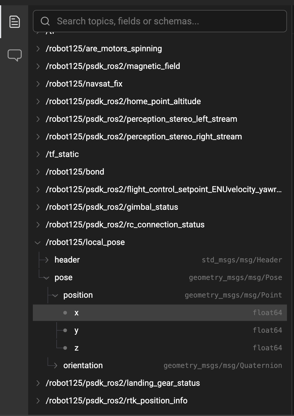
- Use the search box to type part of a topic name or field.
- Click a topic to expand available fields and schema details.
- Drag a field into the center area to create a plot.
Plots and panes
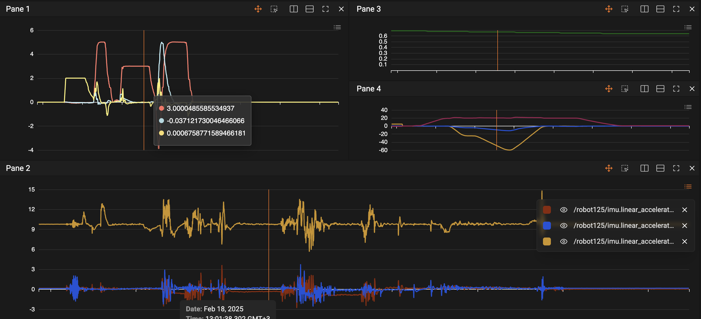
- Each pane can contain multiple plots (lines) overlaid on the same time axis. Plots show the values collected over time and can be toggled on/off in the legend.
- Hovering over plots shows details for the selected timestamp; a vertical play/hover bar helps align measurements across multiple plots.
- Use the pane toolbar to change display modes, remove a pane, or adjust view settings.
Timeline and playback
- The timeline at the bottom (or right-side depending on layout) shows the whole recording range and allows you to zoom to a smaller window for detailed inspection.
- Playback and scrub controls let you move the play head through the recording. This is helpful when you want to observe how multiple signals change together over time.
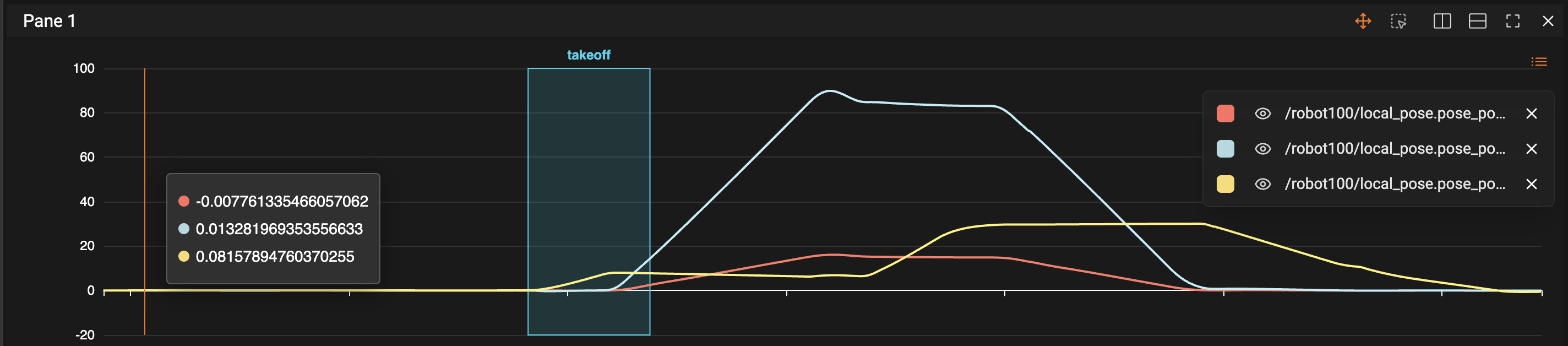
- Colored intervals placed on the timeline represent user-created annotations (for highlighting events or problematic ranges).

Annotations and intervals
- Create annotations by selecting a time range in a plot and adding a label and description. These are saved with the session and shown on the timeline.
- Annotations can be edited or deleted. They’re useful to mark test steps, errors, or interesting events for later review or sharing.
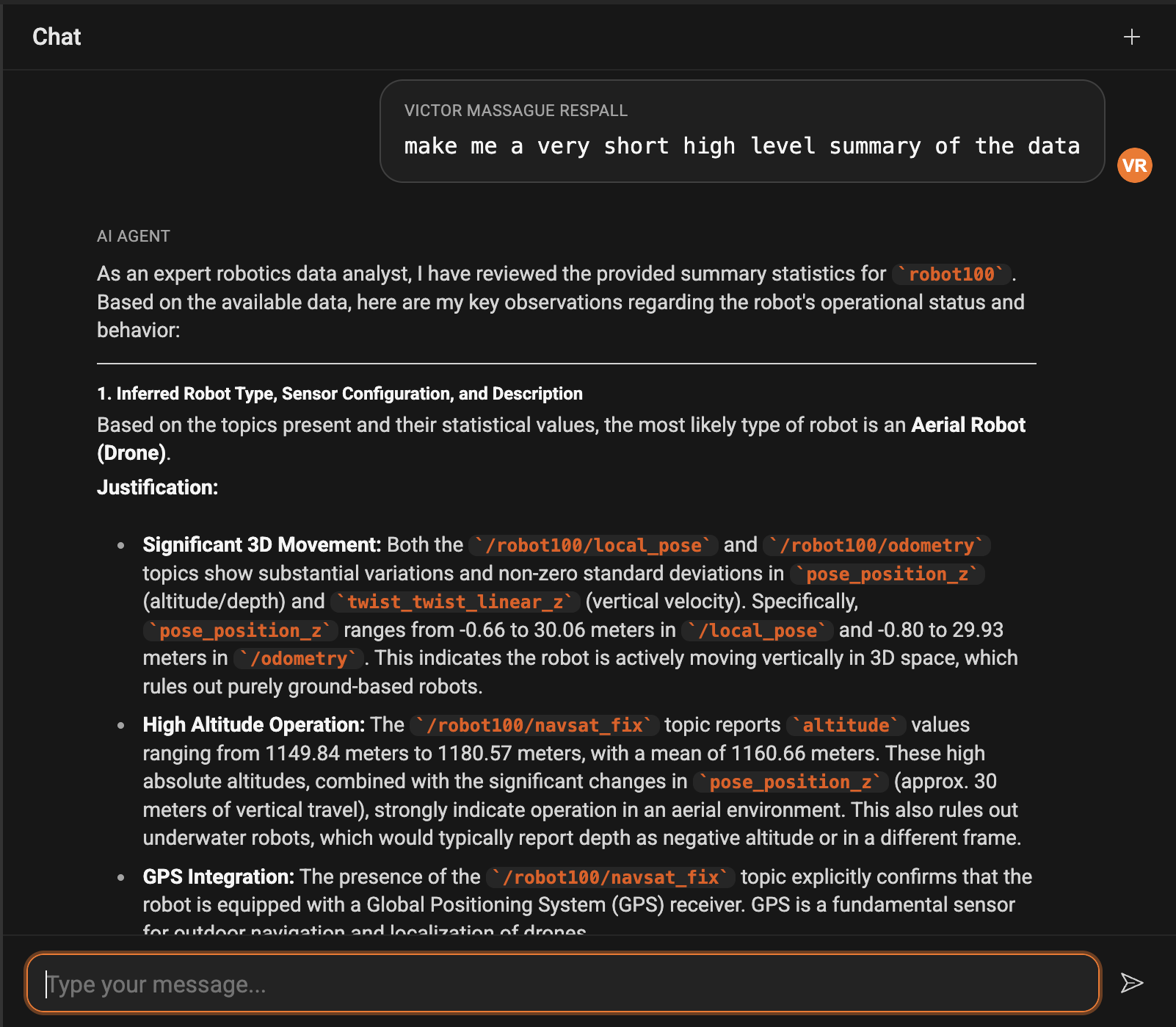
Chat assistant
- The built-in chat helps you interact with the log using natural language. Ask questions like “show the battery voltage” or issue commands to plot common metrics.
- The chat can suggest dashboard layouts or plotting commands, speeding up routine analysis.
Common workflows
- Quick inspection: Drag a topic’s most important field into a pane and zoom the timeline to the period you care about.
- Compare signals: Add multiple fields to the same pane to see how they move together across time.
- Annotate and share: Mark an interval where a problem occurred, add a note, then share the session or save the dashboard for teammates.
- Use the chat for help: Ask the assistant to suggest plots or create a dashboard layout for common analysis tasks.