What you’ll find on this page
- A list of dashboards you can open or create. Dashboards are collections of panels that display metrics and charts related to your devices and services.
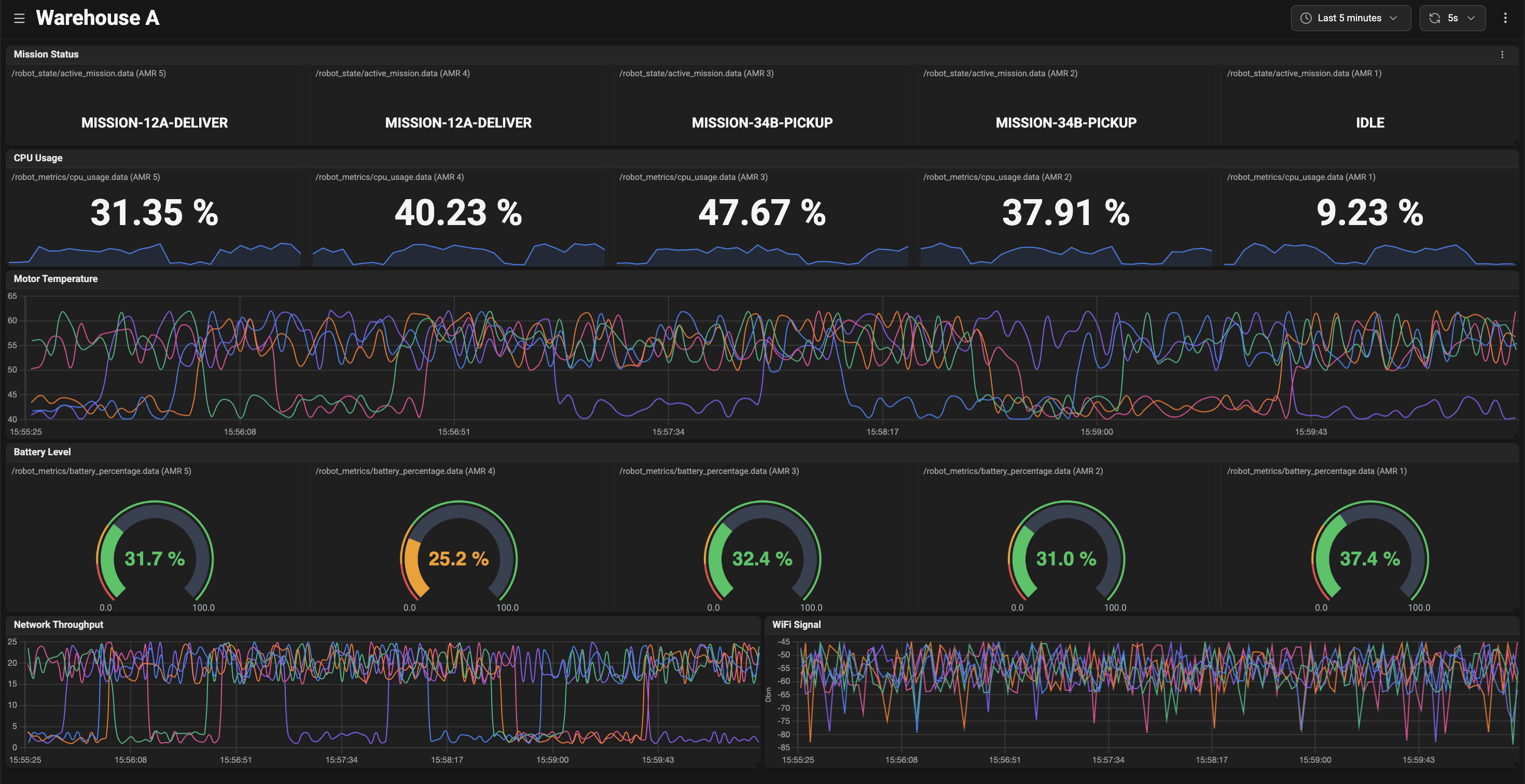
- A flexible grid of panels where each panel shows a chart, gauge, or other visualization for one or more metrics.
- A time-range and refresh control so you can inspect historical data or watch live metrics.
- Controls to add, edit, rename, or delete dashboards and panels.
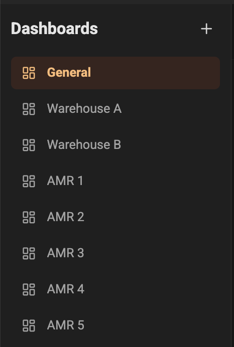
Dashboard list and sidebar
On the left you will see the Dashboard sidebar. It lists all available dashboards and highlights the currently active one.- Select a dashboard to open it in the main view.
- Use the Create button to add a new dashboard. You will be prompted for a name.
- Rename or delete dashboards using the actions next to each dashboard in the list.
- The last dashboard you visited is remembered for convenience.
Header: quick controls
The top header gives quick access to the most common controls:- Dashboard name — shows the name of the dashboard you’re viewing.
- Sidebar toggle — show or hide the sidebar to give more room to the panels.
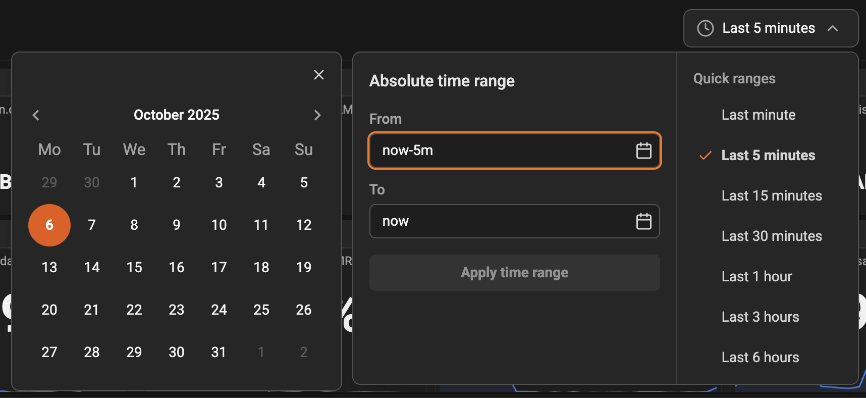
- Time range selector — choose an absolute or relative time window to view historical or live data.
- Refresh interval — set how often the page should pull new data in live mode.
- Add panel — create a new visualization panel on the current dashboard.

- When you switch to a relative time range (for example, “Last 5 minutes”), the dashboard can auto-refresh to show live updates.
- Use the sidebar toggle when you need a larger canvas for many panels.
Panel grid
The main area displays panels in a flexible grid. Each panel contains one visualization (chart, gauge, or stat) that shows metric data. What you can do with panels:- Resize and rearrange panels by dragging. Changes are saved to the dashboard layout so your arrangement persists.
- Maximize a panel to focus on a single visualization.
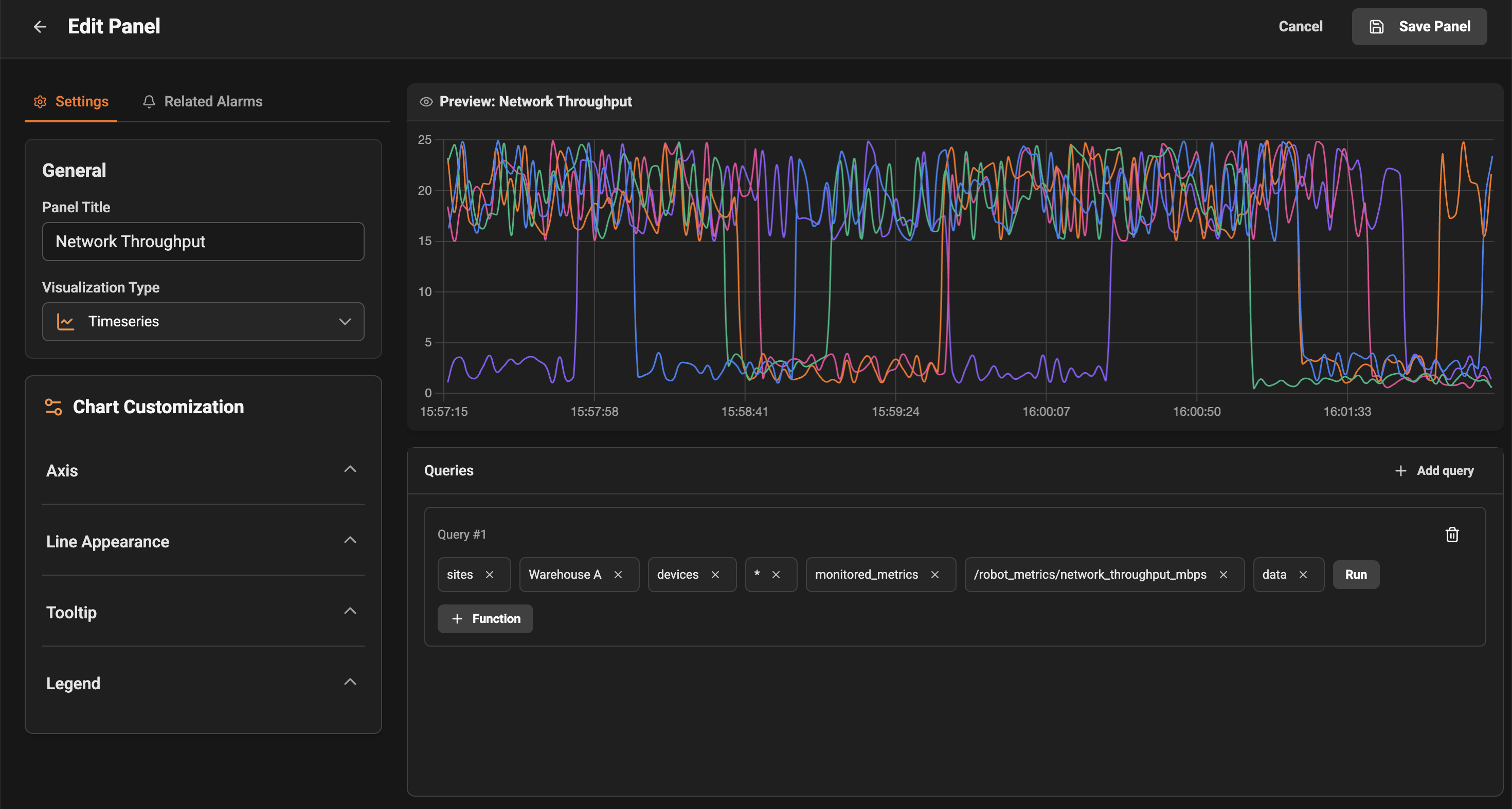
- Open a panel’s configuration to change its title, metrics, visualization type, or queries.
- Remove a panel if you no longer need it on the dashboard.
- Hover over charts to see exact values at a specific timestamp.
- Legends show device names or metric names for easy identification.
Editing and configuring panels
When you open a panel’s configuration you can:- Change the panel title to something descriptive.
- Select the metrics or devices that the panel should show.
- Switch visualization types (for example, gauge, stat, or log).
- Save or cancel changes. If you navigate to a panel configuration directly via a link, use the cancel button to return to the dashboard.
OpenTelemetry quick path
Insaion Monitoring supports OpenTelemetry metrics, logs, and traces.- Enable or confirm ingestion from Devices -> Device Details -> OpenTelemetry Inventory (enabled by default).
- In panel Query Builder, choose OTel data sources (otel_metrics, otel_logs, otel_traces).
- Use Logs and Timeseries panels to detect related traces and open the trace drawer directly.
Time range and live mode
Use the time-range control to inspect a specific historical window (absolute) or to watch recent data (relative).- Absolute time range: choose start and end times to examine a fixed interval of historical data.
- Relative time range: specify a duration (for example, last 15 minutes). When used with a non-zero refresh interval, the dashboard will poll for new data so charts update in near real-time.
Common user scenarios
- Troubleshooting a device: open the dashboard for the site or device, set the time window around when the issue started, and inspect panels for error counters, latency, or unexpected drops.
- Creating a focused view: create a new dashboard and add only the panels you care about for a specific incident or task.
- Sharing a view: copy the dashboard link to share with teammates; they will see the same layout and panels.